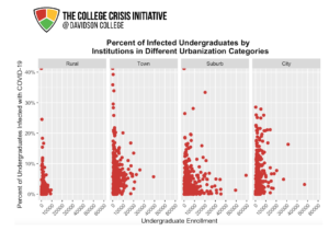
 This graphic examines the percent of infected undergraduates by institutions in different urbanization categories by splitting institutions into rural, town, suburb, and city categories. Each different facet illustrates the percent of infected undergraduates by undergraduate enrollment. Using urbanization and enrollment data from IPEDS and COVID-19 data from C2i, this visualization suggests that the most consistent occurrences of high percentages of undergraduates infected with COVID-19 occurred in town institutions (town being one urbanization level below suburb). Surprisingly, the data that was used show that city institutions with the highest enrollments had relatively lower infection rates compared to institutions in different categories with lower enrollment. These results beg the question — what were the differences in testing frequency and student testing requirements across city, rural, suburb, and town institutions — and different enrollment numbers within each of these categories— that may have impacted an accurate measurement of COVID-19 cases among undergraduates?
| Rural | Town | Suburb | City | |
| Number of Institutions | 139 | 414 | 400 | 365 |
Data Analyst: Rachel McLean
Leave a Reply