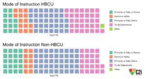
The two waffle graphs show the comparison between mode of instruction for HBCUs and non-HBCUs. The data was taken for mode of instruction for both types of colleges and universities and the percent frequency for each mode is depicted by the squares in the waffle graph.
As we can see from the graphs, fewer HBCUs are “Primarily or Fully In-Person”, compared to non-HBCUs. There are also significantly more HBCUs whose mode of instruction is “To Be Determined”, compared to the number of non-HBCUs with a yet to be determined mode of instruction.
Data Analyst: Caitlin Welch

Leave a Reply